Hey friends! We are back with a Spotlight Saturday! It’s been a while, but I’m so excited to get back and to feature Megan Gillman Wellness!
Megan has had an incredible journey. She left her job in higher education to follow her passion as a wellness and life coach and it was history from there! Megan and I connected online when she was looking for a rebrand and hit it off right away.
We started out with a deep dive into Megan’s brand looking at her mission and values. It seems like a simple task, but truly delving into your who, what, where, when, and why are so important in developing a cohesive brand strategy and image. We crafted her mission statement and the non-negotiables of her business. Some of her core values can be seen below!
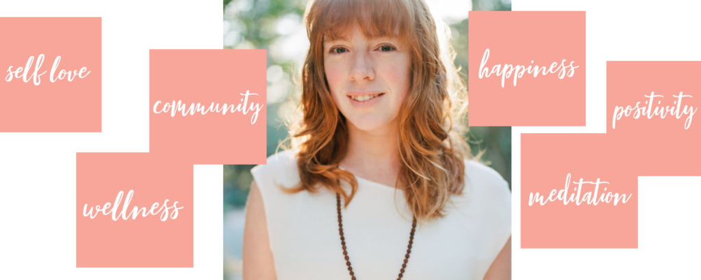
During the process it’s so important to not only understand the mission and values, but exactly who you are serving, which is why we focus on it at the very beginning of the branding process!
Megan and I worked on flushing out who her ideal client is. From her age to her interests, from what car she’s drives to what her goals are, Megan got down to the knitty-gritty to create an ideal client profile!
She speaks of her ideal client below…
“She finally feels that she’s created a lifestyle that allows her to show up for everyone else in her life AND stay healthy, fit, and happy. She also feels super confident in being able to adjust her plan on her own through different stages of her life, so she won’t get taken in again by fake promises or quick fixes.”
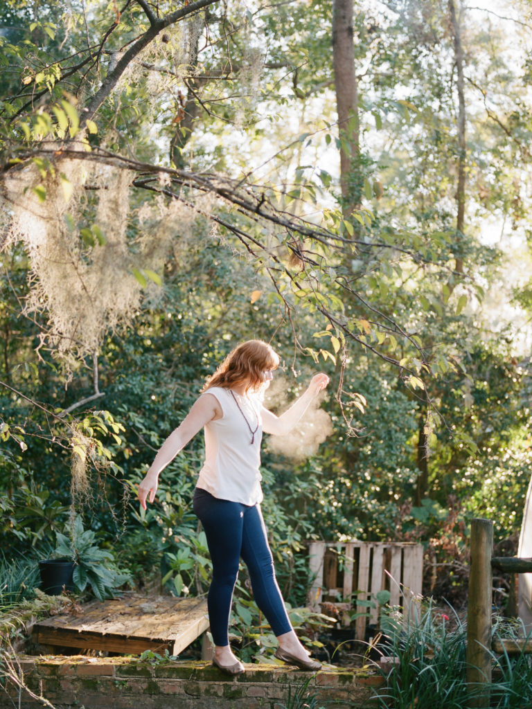
Megan Gillman
I totally relate to her ideal client, which made me even more excited to jump into the design portion of this project!
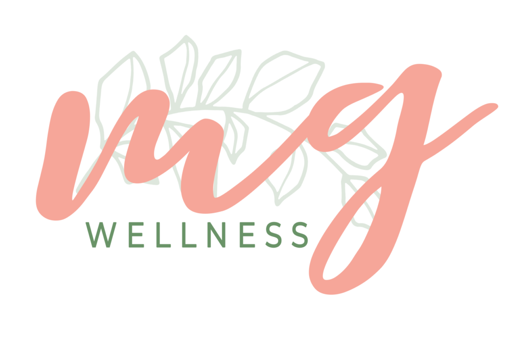
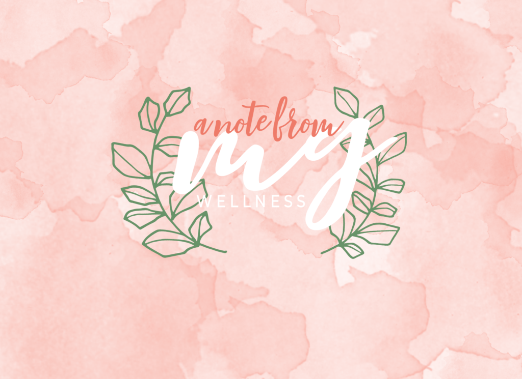
I started out on a quest for brand colors that brought out the emotions that Megan wanted to evoke in her customers. When Megan told me what colors she was looking for, she used adjectives like bold, but warm! After a handful of variations, we pin pointed the color scheme below, which I am so in love with! When we both looked at this combo we saw feminine, bright, natural, and calming, all of which she was wanting to convey to her potential clients! The accent of a brushed gold metal is exactly the addition that the brand needed for some texture. You can check out the final mood board below!
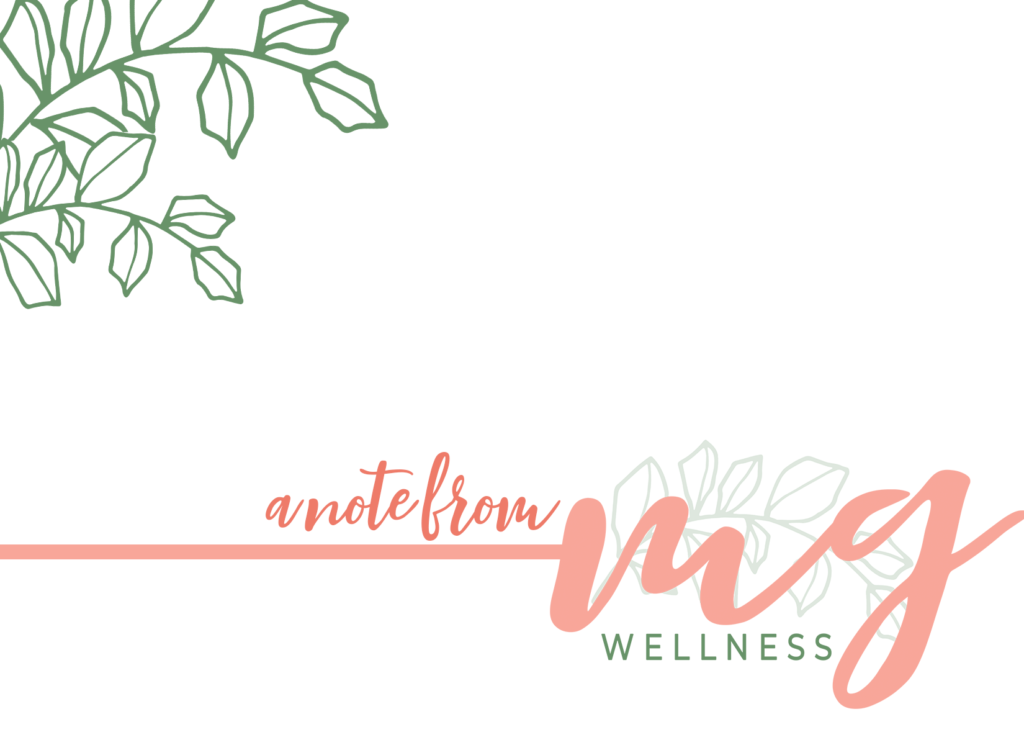
Next up was the logo and submarket design! After a handful of renditions, we ended with this beautifully simplistic, yet welcoming logo and submark. The addition of subtle foliage was the ode to nature that we wanted consistent throughout Megan’s brand!
We concluded the process with branded business cards, social media graphics, and note cards!
It was so much fun working with Megan during such a fun time in her business. I look forward to watching Megan Gillman Wellness grow and change women worldwide!
If you’re looking to focus on your wellness and take charge of your happiness, check out Megan’s website to learn more!
Spotlight Saturday: Megan Gillman Wellness
April 25, 2020
POSTED IN:Branding, Spotlight Saturday
branding
web design
spotlight
saturdays
development
lifestyle
check out
other posts!


COMMENTS